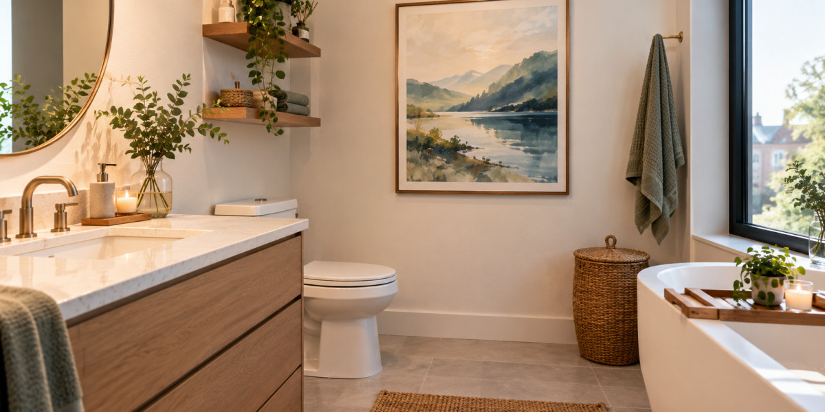

Neutral bathrooms have a timeless appeal. Shades of white, beige, soft grey, and warm taupe create a clean, calming atmosphere that works well in Montreal homes, from contemporary condos downtown to traditional duplexes in neighbourhoods such as Rosemont and Villeray. Yet, while a neutral palette can make a bathroom feel spacious and refined, it can sometimes lack personality.
Wall art offers a simple way to introduce colour without committing to a complete renovation. The right print, photograph, or abstract composition can transform a plain wall into a focal point, adding warmth and character while preserving the room's understated aesthetic.
The secret is to choose artwork that complements the bathroom's existing finishes, responds to its lighting, and suits the practical demands of a humid environment.
Start With Your Bathroom's Existing Colour Palette
Before choosing artwork, take a closer look at the colours already present in your bathroom. Tiles, countertops, cabinetry, flooring, and metal fixtures all influence which shades will look natural in the space.
A bathroom with cool grey tiles and chrome fittings may benefit from artwork featuring muted blues, sage green, or soft lavender. These colours reinforce the room's cooler undertones without making it feel overly coordinated. In contrast, bathrooms with cream tiles, oak cabinetry, or brass fixtures often look more inviting with terracotta, dusty rose, ochre, or earthy green.
You do not need to match every colour exactly. In fact, a little contrast can make the room more interesting.
A useful approach is to select one dominant colour from the artwork that echoes an existing feature, then introduce a secondary shade to create visual depth. For example, a print with olive-green foliage and small touches of rust can connect a pale bathroom to wooden accessories and warm-toned towels.
If the room is almost entirely white, artwork can also establish a new colour direction without requiring changes to permanent finishes.
Choose Colours That Create the Right Atmosphere
Colour affects how a room feels, and the bathroom's intended atmosphere can help guide your selection.
Soft blues for a calm, spa-like feel
Pale blue, deep navy, and blue-green tones work particularly well in bathrooms with white porcelain, light grey stone, or minimalist fixtures. Water-inspired photography, abstract waves, and coastal landscapes can reinforce a sense of tranquillity.
For a subtle effect, choose artwork with a predominantly white background and small areas of blue. If the bathroom needs a stronger focal point, a larger composition with rich indigo or teal can provide contrast.
Greens for freshness and natural warmth
Sage, eucalyptus, moss, and olive green are versatile choices for neutral interiors. Botanical illustrations and leafy compositions introduce organic shapes that soften the hard surfaces of tile, glass, and stone.
Green also pairs naturally with wood, woven baskets, and linen textiles. This makes it especially effective in bathrooms where a combination of modern fixtures and natural materials creates the overall design.
Terracotta and ochre for warmth
Bathrooms with cool white or grey finishes can sometimes feel stark, especially during Montreal's darker winter months. Warm colours such as terracotta, burnt orange, mustard, and muted coral can help counter that effect.
Abstract art with earthy pigments is a good option when you want warmth without introducing a literal theme. A single print featuring rust and sand tones can make a neutral bathroom feel more welcoming while maintaining a sophisticated appearance.
Black and colourful accents for contemporary contrast
Not every bathroom needs soft or subdued colours. If your space features black fixtures, dark cabinetry, or strong geometric lines, artwork with saturated red, cobalt, or emerald accents can add energy.
The key is restraint. One vivid print can make a stronger impression than several competing pieces, particularly in a compact powder room.
Select Artwork That Suits the Size of the Room
Bathroom dimensions should influence both the scale and the arrangement of your wall art.
In a small Montreal condo bathroom, a single vertical print can draw the eye upward and make the room feel more thoughtfully designed. A narrow wall beside the vanity or an open section above the toilet may provide enough space for a carefully chosen piece.
Larger bathrooms can accommodate wider artwork or a coordinated pair of prints. However, filling every available wall with decoration can make even a spacious bathroom feel crowded.
Consider these practical guidelines:
Small bathrooms: Choose one compact statement piece or a slim vertical print with a clear focal point.
Powder rooms: Experiment with stronger colours, playful illustrations, or dramatic abstract compositions because these spaces are often used for shorter visits.
Large bathrooms: Use a larger horizontal print or two complementary pieces to balance an expansive wall.
Bathrooms with patterned tiles: Prefer artwork with simpler shapes and fewer competing colours.
Minimalist bathrooms: Use distinctive colour, texture, or an expressive subject to introduce personality without adding clutter.
Proportion matters as much as the artwork itself. A tiny print placed on a large empty wall may look accidental, while an oversized piece can overwhelm a narrow space.
Before purchasing anything, measure the available wall area and temporarily mark the intended dimensions with painter's